Candlestick Patterns in Forex
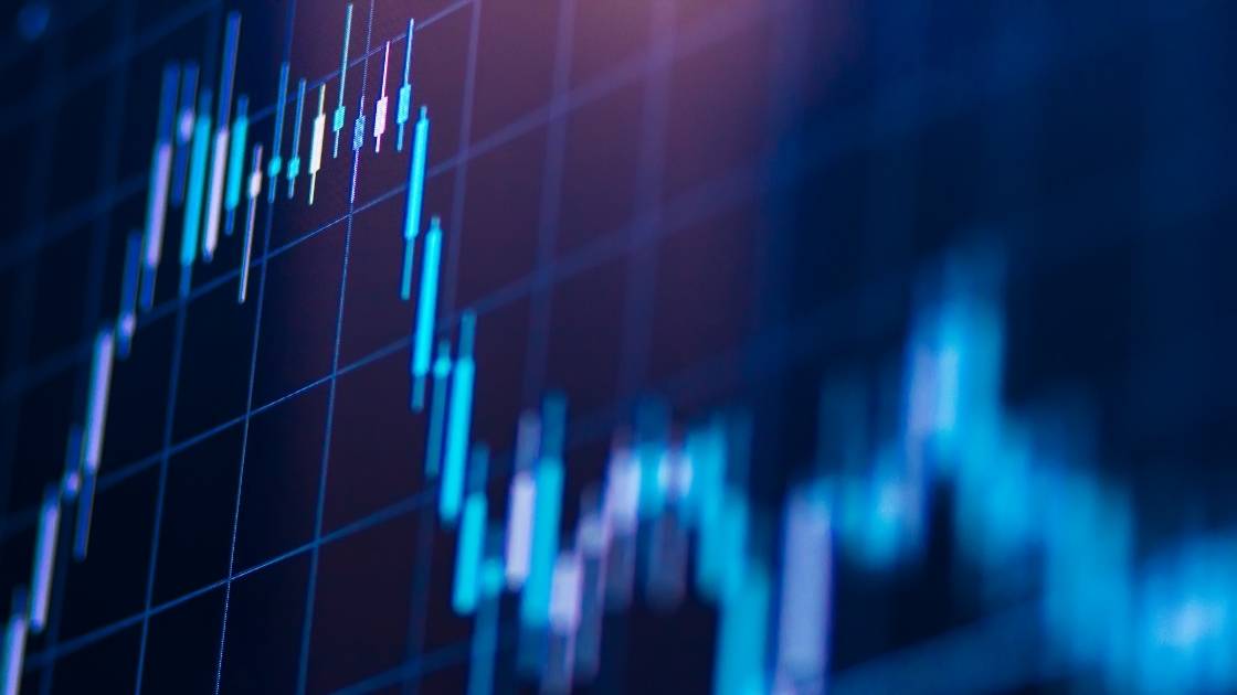
The default chart type you will see when launching a trading platform is almost always the candlestick chart. The name of this chart originates from its appearance. Like most graphs, it is made up of a series of objects which represent some data and spread across a time-series. The objects used in a candlestick chart often look like candlesticks, but they also form many other shapes, such as hammers, hanging men, shooting stars and others.
Although most technical analysis and charting tools in forex are inherited from the field of mathematics and statics, candlesticks were intentionally developed for trading. You may have heard of this chart being called Japanese-candlestick chart, that’s because apparently in the 1700s, the chart was first used by rice farmers and traders. Eventually, they were introduced to electronic trading platforms for trading pretty much every security that has been invested ever since.
What is a candlestick in forex?
What makes candlesticks so versatile when trading forex and other financial markets are that every single candlestick contains a significant amount of information about the opening price, closing price, highest price, and lowest price for a given period. When a series of candlesticks are plotted on a graph, they can form patterns which forex traders use to predict upcoming changes in market behaviour.
A candlestick can be either bullish or bearish. A bullish candle is where the closing price is higher than the opening price, i.e. the price went down. A bearish candle is where the closing price is lower than the opening price, i.e. the price went down. The opening and closing prices are used to from height of the body.
A candlestick also has a wick at the top, and the bottom, which reflects the highest and lowest price reached for the candle. The wick is also known as the shadow or the nose (upper wick) and tail (lower wick). A bullish candle will usually be a positive colour, like green or blue, whereas a bearish candle would be a negative colour, like red or orange. Many trading platforms allow you to customise the colours of the charts to make the information easier to read.
Popular forex candlestick patterns
Because of the characteristics of a candlestick chart, each candle can reveal information about the market and the shapes generated can suggest possible price movements. Traders look for candlestick patterns in forex charts to try and identify possible price movements and predict the direction. Some patterns are known to indicate bullish moves, while others indicate bearish changes, and others suggest indecision. In this article, we will explore some of the most important forex candlestick patterns.
Doji
The Doji candlestick pattern in forex is considered a neutral pattern. It looks like a plus sign because the body is almost as narrow as the wick, which happens because the opening price and closing price are very similar, if not the same. Additionally, the wick is very short on both sides. The formation of a Doji candle shows the price did not move up or down much during the period the candle represents. The pattern indicates that the market is undecided on a direction. It occurs when there is equal selling and buying pressure on either side of the market.

Hammer
The Hammer candlestick pattern, as the name suggests, looks like a hammer. It has a long wick underneath, resembling the handle, with a small body on top, resembling the hammerhead. This candlestick is often found at the bottom of a downtrend and could be interpreted as a bearish reversal. What the hammer demonstrates is although there was selling pressure, ultimately the buying pressure was strong enough to drive the price back up. Although a hammer would be valid whether it is red or blue, a blue candle would be a stronger signal.

Engulfing
An engulfing candlestick is identified when the body of a new candlestick engulfs the body of the previous one. The engulfing candlestick can be either a bullish or bearish signal, depending on the direction of the candles. For example, a bearish candlestick that is engulfed by a bullish candle naturally signals a potential bullish movement and vice versa. The longer the engulfing candle is, the more significant the movement could be.

Why do traders use candlestick patterns in forex?
Many forex traders focus exclusively on technical analysis indicators to forecast potential market movements. As many traders cover their charts with different indicators, they camouflage the candlesticks and the patterns they make and forget that candlesticks say more than just what the price was. Candlestick charts show how supply and demand have pushed and pulled prices over the course of the day. Many indicators lag behind the currency price, but candlesticks are formed using current prices, which means they are generated using the freshest data. Traders can make numerous insights based on the shapes of candlesticks. In this post, we explore just some of them.


